Pages

8.30.2014

Paper Secrets - Part Two

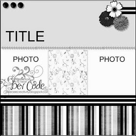
Since InLinkz won't allow me to link up twice from the same post, I've created an additional post for a second layout using the other Paper Secrets August challenge. Below is the sketch for the August 15th challenge...


I changed it a bit to accommodate a single photo and came up with this...

The other part of the challenge is to include items, colors, brands, etc. beginning with each of the letters of the word CAMP. I used the following..Circles, Arrows, Modern Miss (Bo Bunny line of product), Polka Dot (patterned paper).

Thanks for looking and enjoy your weekend!


Paper Secrets - Part One

I hope everyone is having a good weekend...a three-day holiday weekend depending on where you live. Today all our family has done is take one of our cars to have some work done on it, get some errands run, and now we're all sitting in our family room just relaxing...the boys watching a football game while Paolina listens to the Frozen soundtrack with ear buds. Having the kids back to school this week had really made me appreciate our weekend time together...running errands together is actually fun and I don't feel like I need to escape into my crafty space mid-afternoon since I've had plenty of "me" time during the week. Speaking of which, I cannot believe how many layouts I got done this week. Pretty much one each day. The following I did with inspiration from the Paper Secrets' August 1st challenge. Part of the challenge is to use the below sketch...


And this is what I came up with...

The other part of the challenge is to include items, colors, brands, etc. beginning with each of the letters of the word SWIM. I used the following..Stitching, White (cardstock), Inking, Modern Miss (Bo Bunny line of product).

Thanks for looking and stay tuned for the layout I made using the other Paper Secrets August challenge...InLinkz won't allow me to link up twice from the same post.

8.29.2014

Another School Layout

Wow...Friday already?! This week really flew by for me...must be because the kids are back in school. I got to scrapbook almost every day this week. And my husband will be happy to know I also got a lot of household chores done *wink*.

In keeping with my school-theme layout that I posted yesterday I created the below page with Creative Scrapper's Sketch #275. I am also linking it up to the Red Carpet Studio Challenge #77: Billy Madison.

This was Santiago's "formal" kindergarten photo taken last fall. In the spring they have their photos taken again, but they don't have to wear their uniforms. The background paper is from Amy Tangerine's Ready Set Go line, which I have been hanging onto and waiting for the perfect photo. I splattered some glimmer mist on to the background, and believe it or not I also did some masking work, but it just doesn't show up in the photo since the white paint is so close to the color of the background paper. The paper scraps are Bo Bunny's Pop Quiz and Studio Calico's The Pier. The chipboard elements are also Bo Bunny's Pop Quiz as well as a school line of theirs from one or two years ago.

Thanks for looking!

8.28.2014

Scrappy Friends

This back-to-school season has inspired me to create some school-themed layouts, and since I have hardly scrapped any of Santiago's school photos from prior years I figured I had better get moving. For the following page I was inspired by the Scrappy Friends August challenge, which was to use the below sketch from Brenda's blog and color palette from Kelly's blog . There was also a tic tac toe challenge on Rochelle's blog, but I did not manage to incorporate it into my page.


I flipped the sketch and came up with this...

The background paper is from the Echo Park Capture Life line. I had just received it in the mail from the My Scraps & More shop a day or two after I found this challenge and couldn't believe how perfect it was for the color palette! The green paper is so old...Basic Grey's Sultry line. The rest of the patterned paper, as well as the stickers and chipboard elements are Bo Bunny's Pop Quiz line (one of my favorite school lines ever!)

Thanks for looking!

8.27.2014

ScrapMuch?

The kids have only been back to school for two days and I've already found the time to create two layouts! Over the summer I was lucky to get that many done a week.  For inspiration I used two different sketches from ScrapMuch? to create adjoining pages.


This year we opted to not take Paolina for "formal" photos to celebrate her birth milestone. But honesty, I am more than satisfied with these fun photos that I took right out in our backyard with the camera I received for Mother's Day. I feel like they really captured her personality, and I didn't have to settle for a mediocre, awkwardly posed photo from a cookie cutter photo studio.

Back when we lived in California I became friends with a fellow scrapper, and our boys became friends as well. Around the same time that we moved to Texas, their family moved to Israel. Two birthdays after the move, and our kids are still exchanging birthday gifts, just now across the globe. I promised Paolina that if she would let me do our little photo shoot on her birthday, I would let her open her gift from them.

For both layouts I used some papers that my mom gifted to me from one of her paper pads. I wish I could remember the manufacturer and line...it's a super fun pad with lots of gorgeous colors, faux watercolor effects and touches of glitter, On the "Fun to turn 4" page I used some dimensional elements from Studio Calico's The Pier line.

Thanks for looking and please enjoy the rest of your week!


8.25.2014

Let's Get Sketchy August Week 4

Happy Monday! And I do mean happy!! Today is the first day of school for both Santiago and Paolina. Ok, ok...Paolina did go to school all summer because it's a year-round preschool...but yay for both kids being back to school at the same time! Next year will be even better when she starts kinder and they are at the same school too.

Another reason to be excited, especially if you don't have school-aged children starting back today, is that Let's Get Sketchy has a new sketch...


My take on it...

I realize that the summer season is not officially over, so it may seem premature to be thinking about Halloween, but both of my kids have already decided on this year's costumes and all the discussion just got me into a Halloween mood. So I pulled out these photos of Santiago's 2nd Halloween when he was just 18 months old. I'm ridiculously behind on my Halloween layouts...I've only done Santiago and Paolina's 1st Halloweens...so I have a lot product in my stash with that theme. I think that most of this page was done with older My Mind's Eye and Basic Grey Halloween lines.

Now please head on over to the Let's Get Sketchy blog to see what the rest of Team B did with this sketch.

8.23.2014

Stuck?! Sketches

Happy Saturday everyone! This is our last weekend before school starts on Monday. We had so much fun with summer camp and LOTS of days at the pool, but I am definitely ready for a consistent routine again. It's good to know that I will have consistent scrappy time too! This entire summer has been pretty hit or miss for creating, as well as posting my creations. A perfect example is the following page. I actually put it together about two weeks ago but just haven't had time (or accommodating weather) to get it photographed until yesterday. And I am just now finding a few spare moments to share it with you. For inspiration I used the below sketch from Stuck?! Sketches...


And I came up with this...

I had been taking picture of Paolina when she was 4 weeks old, and after a few good shots she broke into tears. I wasn't originally planning to scrap these photos, but upon reflection I decided that memories of my infant screaming bloody murder is just as much a part of life (if  not more) as the pleasant memories. So in the album, the "cute " photos are on an adjacent page to this layout.

For the background I used paper from Studio Calico's The Pier line. Is it not perfect with Paolina's top?! And on it I used some Gesso with a Crafter's Workshop template to tone down the busy pattern as well as add a little additional texture. The other patterned papers are miscellaneous scraps from other projects. It seems like it's been forever since I used any flowers on my pages so it felt good to dive into my flower stash for this layout. Also from my stash are some tags from My Mind's Eye Wild Asparagus line & Basic Grey's Lily Kate line, as well as a crocheted flower from My Mind's Eye Laundry Line. It's always such a great feeling to use older product from my ridiculously large stash on my pages.

Thanks so much for looking and please enjoy your weekend!


8.15.2014

Scrap Our Stash Guest Designer

I always love playing along with the challenges at Scrap Our Stash, so it has been such an honor to serve as their August Guest Designer. The second challenge of the month is to use the below sketch and 75% of the product used must be from some of your oldest stash...the older the better.


And here is my take on it...
I really enjoyed working with this sketch! It's different from anything I usually do, but I like to stretch my creativity in order to grow my style. I also love using up older product. I find that it's easy to get caught up in purchasing the latest & greatest before I've even gone through what I already have. The patterned papers are from the Sassafras Lass "Whale of a Tale" line, which I think is about 5 years old, and the background paper is My Mind's Eye Meadowlark. I also used some blue alpha stickers from Bo Bunny that must be over 6 years old because I remember buying them before Santiago was born. This sketch and challenge were the perfect way to make my older product look totally current!

Now I hope you will dig into your oldest stash and use this sketch to create your own page! You have until August 29th to link it up at Scrap Our Stash for a chance to win a prize from Nani ke Ola.

My Scraps & More Sketches #89

Happy happy Friday! And since it's the third Friday of the month it's time for a new sketch at My Scraps & More Sketches.


And here's my take on it...
When I saw the sketch, the first thing that popped into my mind was a paper from Studio Calico's Lemon Lush. 
And the paper made me think of this photo of Noé and myself when we were at a 70's themed costume party. Let me tell you...I have had the picture for quite some time (the party was back in 2007) but I just have not been able to get it scrapped. Take a look at those colors we're wearing and you can clearly see my dilemma. In any other circumstance involving clashing colors in a photo, I simply print it out in black & white. But since the obnoxious colors are part of the "charm" of our 70's style costumes, I knew I needed to maintain the integrity of them. Needless to say I was thrilled that between the sketch and the paper, this layout fell into place perfectly!

I hope you are also able to find some inspiration from the sketch, and please head over to the My Scraps & More Sketches blog to see what the rest of Team A did with it.


8.11.2014

Let's Get Sketchy August Week 2

Another Monday which means it's time for another sketch at Let's Get Sketchy...


I rotated the sketch and came up with this...
I don't usually scrap the same photo twice, but I had gotten this photo developed in both color and black & white, not knowing which I wanted to use. In the end I decided to use both...the previous layout I used it on will go in our family album for 2014, but this one will go in my "Book About Me". Several years ago I thought I would start one since I tend to scrap my kids 95% of the time, and although I've only done a handful of pages at least I'm creating some pages about me.

As always our design team has lots of inspiration for you using the sketch. I hope you will take the time to head over to the Let's Get Sketchy blog to check it out, as well as join in the fun!


8.10.2014

Get Inspired Magazine

Have you heard the news? Get Inspired Magazine Issue 4 has gone live! You can view it here. And below are my contributions...

For this page I used a few photos of Paolina & Santiago getting ready to release their balloons to Los Tres Reyes in January of this year. For product I used mostly Bo Bunny Modern Miss, although the animal print paper is left over from a project I did with a jungle theme, and I believe I originally bought it from Hobby Lobby. I couldn't resist incorporating it since it matches Paolina's vest so perfectly. For inspiration I used a sketch by the Get Inspired Magazine's assistant editor Laura Whitaker.

This layout uses a photo of Santiago when he was 9 or 10 months old. I miss his round baby cheeks! Almost all the product I used is older...the background paper is Scribble Scrabble, the scraps are Dream Street Papers and Basic Grey Granola, the dinosaur chipboard is My Mind's Eye Abbey Road, and the title is American Crafts Thickers and Bo Bunny alpha stickers. The Studio Calico cork arrow is the only "new" item which was part of a prize I received from a Scrappy Friends challenge.


For this final layout I used a photo that Noé took of a sunset on Laguna Beach, CA, when we were there to celebrate Valentine's Day back in 2007. All of the paper is from Paper House. The doilies are Bo Bunny, the rub-ons are My Mind's Eye Laundry Line, the ampersand is American Crafts Thickers, and the chipboard words have been in my stash for so long I have no idea where they are from.

I really hope you will take the time to check out this issue of Get Inspired Magazine. The editors worked so hard to put it together, and there is so much inspiration from our amazing design team as well as the submissions from our readers. If you are interested in being published in issue five, you can get more information here.


8.01.2014

Scrap Our Stash Guest Designer

Back in June I had the honor of having a layout chosen as a Top Pick at Scrap Our Stash. Along with this distinction I was doubly honored by being asked to guest design for them in the month of August. So here is my layout for the first challenge of the month...

Challenge #17 is to create a layout using a selfie photo and to use a premade/packaged frame from our stash. I used a selfie of myself that I took on St. Patrick's Day this year. Back before kids I usually celebrated by drinking a Guinness (or two...or three lol), but since I've had little one(s) home with me for the last six years, now I opt for just wearing  my Guinness cap. Since I created this page for Scrap Our Stash, it seemed like I ought to use as much older product & scraps as possible. My background paper is Scribble Scrabble...is that manufacturer even still in business?? And the scraps are from Basic Grey Fresh Cut, Crate Paper Love Notes and Bo Bunny Modern Miss. For the frame I dug into my stash and found a pink one from My Mind's Eye Just Dreamy 2. I cut it in half and tucked it behind the layers to give an illusion of it being much longer than it actually is.

Thank you to Scrap Our Stash for not only asking me to guest design this month, but also to make a small dent in my ridiculously large stash of scrappy product! I hope you will head over to their blog and join in with this challenge as well.